Mild Rant Over Cover Songs on YouTube

I love listening to cover songs. I mostly find them on YouTube. I find that the best covers are done when the artists bring something that the original songs don’t have.

When the covering artist adds another layer to the original, it’s awesome. So when I try to find covers on YouTube and all I see are 18 year olds with a guitar doing whatever pop song is popular for the month, I get really disappointed. Not to fault them for practicing, it’s just that they are not unique. (They can be faulted for shitty sound quality, musical skill, etc.)

I admit, this song is very over-played by now, but I think for good reason.

Too Close by Alex Clare is just an enjoyable damn song. His voice a strong and passionate, and the wub-wubs actually add to the song. There are no good covers of the song. It’s almost nothing but young dudes and dudettes with a guitar. (And the song is so easy to play: the same five chords over and over. See: House of the Rising Sun.) Oddly enough, the only good cover I’ve seen is actually done by Alex Clare!

And then what’s worse is when the song is already different than everything else, no one can take it even one step further.

I’m talking about Your Woman by White Town. Here’s an interesting song. A male vocalist, singing in low key, but the lyrics are from a woman’s point of view. It’s a one-sided conversation and she’s talking to a man whom she regrets to tell that she can’t be his woman.

It’s not ironic, but rather subversive. It’s almost insincere. The words come off as disingenuous and overall I don’t know what to make of the tone of the song.

I say all that, because of this cover of it.

It’s done sincerely by a woman, accompanied just by a guitar. It’s heartfelt, it’s straight forward, and ultimately, mundane. When it’s done straight, it sounds like any other sad song played by any other sad girl. There’s nothing about this cover that makes it interesting to me.

So, if you, dear reader, want to cover a song and publish it on YouTube, please make it interesting. Make it unique. This is an extension of one of the best pieces of advice I’ve ever heard for being creative. When making anything, make it your own.

There’s always going to be someone who’s better than you at what you want to do. Get used to that. But no one will be better at YOU. No one will write a better you story, no one will sing your voice better. As long as your being yourself, you can’t be out done. If you can’t do better or give more, then may be you should reconsider what you’re doing.

Tagged , , , , ,

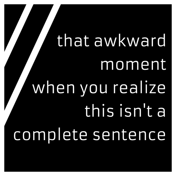
That Awkward Moment…

I hate this meme. I generally don’t like memes anyway. (And no, you stupid spellchecker, “meme” is an actual word!) I hate it when people quote memes in real conversations (e.g. blank all the blanks). I was in a snarky mood, today, so I made this.

awkward_sentence.jpg

Best News Apps for Nexus 7

The Nexus 7 is one of the best devices to read anything on. There are a number of news reading apps for Android. I’m going to rundown three of the best for the Nexus 7: Google Currents, Feedly, and Flipboard.

Google Currents

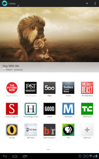
unnamed_currentsCurrents comes preloaded on the Nexus and is made by Google. It has a minimal design, but still very “Holo” looking. The top half of the home screen is a slide show of top stories of your subscriptions. The bottom is just a grid of icons. Click on one and you get a nice magazine layout, three articles to a page. Of course, this depends on what the author chooses, but that’s what it is for most. Because it’s on Android, it takes advantage of the enormous share menu.

Pros

  • Minimal and clean interface
  • Lots of popular blogs free to subscribe to.
  • Each article is nicely formatted. It’s up to each producer to customize their content, but no matter what each looks nice.
  • Blogs that aren’t featured sources can be added through a search or via your own Google Reader subscriptions.

Cons

  • So far, the only news app that doesn’t organize content by category. Also, compared to the others, it doesn’t easily show top news stories at a quick glance. The slide show it does have isn’t very helpful.
  • Also the only one that doesn’t have a widget. I find those handy, again at a quick glance.

Bottom Line

I really want to like Currents. It’s nice to read, but I feel like I have to go out of my way to even open it. The other apps I reviewed all have easy ways into the app, like widgets and top story filtering. It seems as though Google made the app with big dreams for its future and just forgot about it.

Google Currents on Google Play

Flipboard

unnamedflipboard

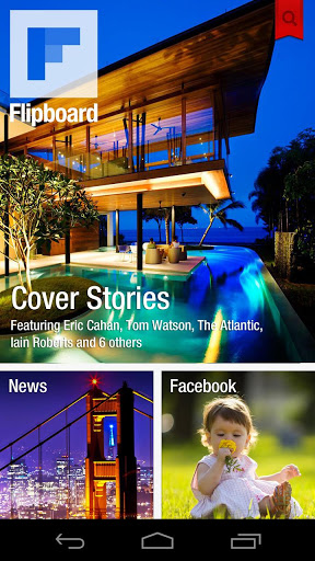
If you haven’t heard about this one, I want to know where you’ve been. A practically necessary app for the iPad. It was exclusively available for the Samsung Galaxy SIII then opened up for all Android soon after. I wonder about this: it started as an iPad app, then it was ported to Android for phones. Then it was available for the iPhone. Yet there is no native Android tablet version. Either way it doesn’t look bad on the 7″ screen.

Pros

  • The real reason Flipboard is such an amazing app is that it combines almost every social network you could have (Twitter, Google+, Google Reader, Tumblr, Instagram, more) and pulls the content from links and pictures. Combine that with a beautiful magazine-like flipping gesture and an easy to access “Cover Stories” section.
  • Sizable home screen widget.
  • Curated feed bundles by topic and certain cities.
  • Some podcast feeds.

Cons

  • Inconsistent content viewing. I don’t know what it’s like on an iPad, but since the format was made for a smaller phone screen, the article views are odd. Some sources use the flipping animation. Some just open up a web page within the app. Sometimes the font is small, sometimes big, sometimes serif fonts, sometimes sans.

Bottom Line

I have a love/hate relationship with Flipboard. The design is great and I love seeing all my social feeds in one place. Not to mention the fact that the Facebook integration is so much better than the actual Facebook app. But, for my money (they’re all free), other apps handle news better.

Flipboard on Google Play

Feedly

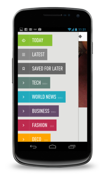
mobile-homeFeedly is actually a front-end for Google Reader with both a desktop app (via browser addon) and mobile apps. Because it syncs with Google Reader, all the apps sync with each other. The app is simple to use. It takes advantage of gestures and has read later app integration. Pocket is my app of choice. If a link is tapped, it opens up a browser in the app, then an option to de-clutter the web page appears, which allows just text to be read.

Pros

  • Home Screen Widget. The beta version is an improvement, and that should show up in the next update of the app.
  • Web app syncing.
  • Easy to read top/new stories
  • Pre-bundled subscriptions by topic for new users.

Cons

  • It maybe just me, but every so often, the app freezes up and registers a long press without my finger. The long press bookmarks an article. So, afterwards, I have to clean up my Pocket queue.
  • The app also logs me out of my Google account every now and then.

    unnamed

Bottom Line

This is my favorite news reader. I’ve been using Google Reader as my RSS feed reader for years and this app makes it usable and pretty, on both my browser and my device. It has a few annoyances, but the benefits far outweigh them.

Feedly on Google Play

Now, I know I missed some like Google’s actual Google Reader App, Pulse News, and others. If you have a favorite, let me know in the comments.

Tagged , , , , , , , , , , , , ,

Elementary OS Luna Beta 1 Thoughts

First Impressions

I’ve been using the new Elementary OS Luna Beta 1 for the past few days and I have to say I like it.

First things first, it is fast. It’s a simple GTK desktop, but instead of using Gnome Shell, it’s using an in-house desktop environment called Pantheon. Combine that with lightweight native apps, like Midori and Scratch (more below), and a clean and minimal theme, the whole package is responsive, nice looking, and a pleasure to use.

Standout Features

  • Workspace Management – Pantheon is wonderful. It has a toned down take on multiple workspaces. The whole desktop slides up and reveals the spaces. Instead of window thumbnails, just an icon represents windows. Just drag and drop to a new space.
  • Geary (mail app) – I’ve never preferred to use a desktop mail app. Maybe that’s my generation. My first email client was in the web. That said, I think Geary, developed by Yorba, best displays the ideal, uniform look of the default apps. It has one toolbar with nice icons, a side bar with folders, then a split message view. It syncs wonderfully with Gmail and the messages are threaded conversations.It also displays one of my gripes. There aren’t enough settings to make me comfortable. I understand, taking a page out of the book of Apple, minimal beauty means hiding things. One little menu at the far right doesn’t cut it. I’m not unhappy, I just wouldn’t recommend this OS for a power user who want infinite control over every little detail of their desktop. Moving one.
  • Scratch (text editor) – It wouldn’t take one long to notice that Elementary OS is without a word processor, spreadsheet creator or other office suite software. (Obviously not counting email and a calendar). And that’s ok with me. Yeah, I can install one, but I’d rather use Google Drive as I have for years.Elementary OS does have a very nice text editor, built for Elementary. So far, it’s my favorite text editing app. My favorite feature is automatic saving and a very simple version restore. It may be too underpowered for a programmer, but for a writer like myself, it’s more than enough to make me happy. Every document I type is automatically saved to my Dropbox folder and that folder is automatically synced up to the cloud. I don’t have to think about it. I wrote this article in it.

Complaints

I really want to like Midori, the default web browser. It’s basically a Safari clone for GNOME. It’s been around forever, uses Webkit, it’s lightweight and all around decent. But I’ve gotten so used to addons and syncing features of both Chrome and Firefox that being without those seems like such a step back in time. Also, unless my internet was sufficiently fast, Midori would freeze up then crash.

That also mirrors my sentiments toward Noise, the music player. It’s a very simple and nice looking app (if not a little too iTunesy, ahem). I had trouble importing certain songs. It would just hang, then they wouldn’t be in the library. Then again, I use Google Play Music for all my music, then there’s VLC for everything else.

My other problems are simply nit-picking over the interface. Most of the default apps follow a nice consistency: gray top toolbar, settings gear on the right. Apps like Shotwell (also made by Yorba) don’t follow this. For the most part it doesn’t matter, but people will notice. Yet, I don’t know how this can be fixed. When Ubuntu tried a global menu bar, like OS X has, it was very controversial. Hopefully these guys can figure it out.

I also installed a different icon theme. The default is nice, but certain themes use monochrome icons on the toolbar and it just looks nicer.

Final Thoughts

For a Beta, Luna is very solid. I have yet to be rendered with a useless machine. There have been a few crashes here and there, but overall the good far outweighs the bad. That being, again, fast.

Yet, here’s my worry. Luna has been in the making for a year and a half. The first version of Elementary OS “Jupiter” was released March 2011. And this is only the beta.

They’ve been following the philosophy release “when it’s ready.” That’s great for perfectionists, but when it comes down to it, deadlines are better motivators than perfection. As a user, I hope I’m not stuck waiting for the next thing. Then I would start to question if it was worth it.

Get back to me on that question when the final version drops.
Elementary OS Luna Beta 1

Update: A reader pointed out an error, which I fixed, and I also wanted to point out that the window manager is called Gala.

Tagged , , , ,

My Steampunk Problem

I like the idea of Retro-Futurism. It’s just fun. The technology of our time is very dear to us all. There is nothing more personal than the smartphone we put in our pocket, or the screens we stare at. But the present is boring, and the future worries us, at the very least.

The Past! That was fun, right? When we merge nostalgia, technology and pulp fiction we get awesome, genre bending worlds. All other -punks aside, the one I’m talking about right now is Steampunk. In my opinion, this subgenre is one good movie away from being mainstream. I said good movie. So that doesn’t mean The League of Extraordinary Gentlemen, Van Helsing, or Wild Wild West.

If you’re unfamiliar with steampunk, essentially, it’s applying Victorian-Era aesthetics to modern day technology. Of course it gets deeper than that, but I don’t think I’m doing it a disservice at all by describing it that way. Yet, therein lies my problem with it.

Victorian” refers mainly to England, when the empire was under Queen Victoria’s rule in the late 19th century. It was the very peak of the Crown’s power over the rest of the world. The United states was recovering from a bloody civil war and hadn’t secured its place as a global power yet. The industrial revolution would not happen until after the turn of the century.

Despite those facts, SteamPunks are many amongst geeks here in the states, and elsewhere. Go to any Con’ and see how many leather corsets, goggles, and little hats you see. They might be pirates, adventurers, aristocrats, whatever. Take a look at what’s popular amongst YA fiction. Watch Felicia Day’s YouTube channel, tell me she’s not influenced.

Do you see the disconnect I have? I’m being all hipster-y about it. I really don’t care how much exposure it’s getting, beyond my already standing problems. If you haven’t caught it, this genre is, for the most part,  inherently Euro-Centric, make that Anglo-Centric. I am of Mexican/Spanish heritage. See it yet?


I’m not accusing steampunk or fans of as being racist. Don’t get me wrong. Of course I understand that nationalism has nothing to do with liking the look, or enjoying the stories. What I’m saying is I have a problem personally identifying with a genre that has very little to do with my own heritage, and in turn, part of my identity.

It’s the same problem I have with Tolkienesque fantasy. Those stories are all derived from the history and folklore of Western Europe. I’ll talk more about that on another day.

I don’t have this problem with Dieselpunk, which takes aesthetics from the time after the Industrial Revolution (Art Deco, BioShock, Sky Captain and The World of Tomorrow). I can say that, as it’s very based in American history, which I identify with more, being a third-generation American (my grandparents were born in Colorado and Nebraska).

I must say here, that I’m not saying I don’t like this genre, I just can’t connect with it like so many of the fans I see. I’m not complaining as much as stating a point.

I know for a fact that I’m not the only one of my kind with this problem. I direct your attention to this awesome article I found on the blog Racialicious.com. The basic gist is that many Chicano/Latino/Hispanic people who want to claim fandom of Steampunk take aesthetics of what was going on in our history, instead of Anglo history: The Mexican Revolution.

This was no insignificant event. Some history, from the article:

The independence of Mexico triggered the independence of eight different countries. After the fall of the first Mexican Empire, Guatemala, Belize, Honduras, El Salvador, Costa Rica, Nicaragua, and the republics of Yucatan and Chiapas, which later were re-annexed to the Republic of Mexico, declared independence. The Republic also still retained the territories of Texas, New Mexico, and southern California.

So, for my little conundrum, following in the footsteps of others might help:

Interestingly, it is this point in history that many Mexicans use as basis for its aesthetics and steampunk characters. This later time period that we know of as the Mexican Revolution in the early twentieth century also acted like a late call to join the spirit of technological renovation and industrialization that had been held by the European powers. The Mexicans of the late nineteenth century conceived many elements of progress and technological heritage from the French, who were a major presence in the country’s development during this century. Both the fashion and lifestyle, cuisine, style of education, politics, economics, and technology came from the French style.

But here’s where I make all this for naught: I don’t care. Steampunk is huge right now, and I can only see it getting bigger. Like I said, one good movie, most likely in the next year, would solidify it’s popularity for the time being. All the purists will hate it for stupid reasons, while everyone else will enjoy wearing their little hats. As for me? I’m going to watch from the sidelines.

Though I have found my entry point, what I’m saying is that I don’t need it, want it, care for it. Again, I have no problems with the stories, the fans, the aesthetics. It’s just not for me. I think it’s because it’s looking to the past. I’ve never been one for nostalgia, especially nostalgia of a time I’ve never experienced. And it’s always confused me why the Victorian era appeals so much to women. It’s so easy for them to forget how little freedom women had at that time. Maybe it’s empowering to erase that fact from current retro futurism. Just as it’s easy for people of other heritages who don’t share direct heritage with English descendants.

I hate to just chalk up everything that people like about it to a “look.” I understand how cool things look when it’s all wood and leather and steam powered. The anachronism of a steampunk Iron Man suit is intriguing confusing and exciting all at once. But without the connection that comes from heritage of any sort, I’m left confused and hoping there’s more. For the sake of how I see the fans, more than just “it looks cool.”

Tagged , , , , , , , ,